•UI • UX• Mobile • Design Practice •
Project Overview
Cinemood is an app designed for Colombian avid movie-goers that provides them with up-to-date information on current movies across all cinema chains in Colombia. The app allows users to watch trailers and to select a theater showing to seamlessly redirect them to the corresponding cinema chain to buy tickets. It's perfect for busy working adults who want to easily find and book their next cinema experience.
My Role
UX Researcher and UX/UI Designer.
Challenge:
Currently, in Colombia, there are several cinema chains, each with its own website for checking current movies and theater showtimes. However, not all of them have dedicated apps, resulting in scattered information about current movies.
Objective:
Provide a user-friendly platform that allows Colombian cinema-goers to easily discover and access up-to-date information on movies across all cinema chains in the country by using UI/UX skills.
Design Roadmap
Research
To understand the needs of the people I'm designing for, I reached out to 5 avid movie-goers between the ages of 20 and 30 who visit the cinema at least twice a month to interview them. As we chatted, I discovered that many of them lead busy lives and struggle to stay up to date with the latest films. However, they all shared a love for the cinema experience, and were keen to find a way to make it easier to stay in the know about what's playing. Some of the questions asked were:
How do you find out about new movies?
How do you pick what movie to watch in the cinema?
Do you experience any challenge when looking for a movie trailer?
Pain points
User Challenge
• Working adults may find it difficult to keep up to date with current and coming soon movies, due to lack of time.
• The availability of movies in different cinemas can be inconsistent, and users may have their own cinema preferences.
• Asking for recommendations can be challenging due to spoilers or a lack of knowledge about current movies.
Discoverability
• Different cinema chains may have special projections that users may not be aware of.
• Platforms that allow users to search for movie trailers can require too many steps to find the desired trailer.
• It can be annoying to check every cinema website or app to look for a specific movie.
• Movie trailers may only be available in certain languages on different platforms.
Accessibility
•Closed captioning is not always available for movie trailers.
•Users with hearing impairments may face difficulty accessing movie trailers.
Who is the user?
Based on my research and interviews, in order to address these pain points and provide a more enjoyable and convenient movie-going or movie discovering experience, I created a UX persona .
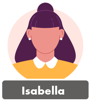
Meet Isabella!, an avid movie-goer who is a full-time worker that enjoys nothing more than a night at the movies. She appreciates the entire cinematic experience and wants to stay updated on the latest releases, as well as watch trailers, all in one convenient place.
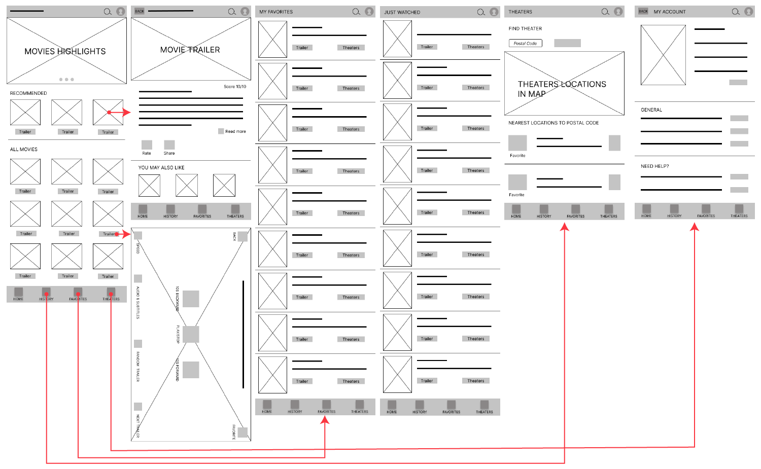
Low Fidelity Design
The first design iterations were done on paper to explore different flows and features that could address the user pain points. The focus of the design was in two main ideas: first, to help the user to discover new movies and second, to help the user to remember movies they liked or that they might have seen the trailer. The best flow made on paper prototypes was then move to digital to create the low fidelity prototype.
Low-fidelity design user flow:
Usability Studies
Two usability studies were conducted for a movie trailer app. The first used a low-fidelity prototype to identify user challenges and gather feedback. Based on these insights, a high-fidelity prototype was created and evaluated in the second study. Both studies aimed to gather insights into the user experience and inform further design. The study was conducted remotely in Colombia with five participants aged 18-50 (3 male, 2 female), and was moderated by me.
Both usability studies were analyzed using a consistent approach. During the interviews, a note-taking spreadsheet was created for each participant to capture their observations, identifying patterns, frustrations, and needs. I then organized the various insights obtained from the note-taking into virtual post-it notes, categorizing them accordingly. This is how it looked for the first usability study.
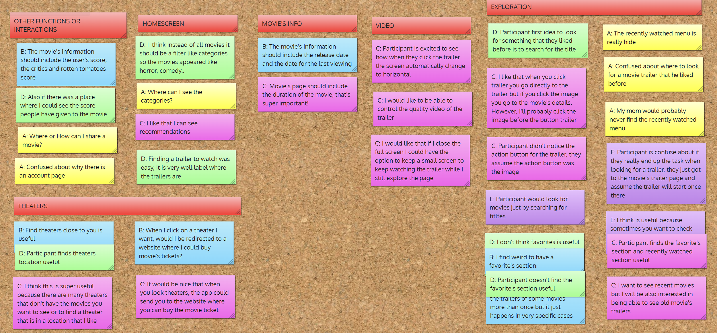
Findings
Users found it difficult to navigate the "recently watched" submenu, which was confusing and easy to lose.
Many users expressed a desire to see the movie's score and critics' ratings as important information.
Users suggested a feature to filter movies by categories on the main page, making it easier to find movies of interest.
Users liked the deadline notification that inform them that there is a few more days before the movie is no longer available, but they barely notice the notification.
Users like the idea of a filter but not the categories used, they express they would prefer cinema chain or theaters near them as categories.
Users would like to navigate from theaters to specific movies at that location.
Design Iterations
Adjustments made after the first usability study:
Developed a UI design for the app.
Re-designed the bottom navigation menu to feature a clear separation between "recently watched/history" and "favorites".
Added more information to the "movie details" screen, including the movie's score on the app and other websites, the critics' rating, and the option to give a score to a movie.
Adjustments made after the second usability study:
Implemented a filter on the home screen to allow users to filter movies by favorite cinemas, closer cinemas, and cinema chains.
Added a more noticeable notification pop-up to inform users about the "last day to watch" information.
Developed a new screen to show specific movies being shown at a theater when users click on it.
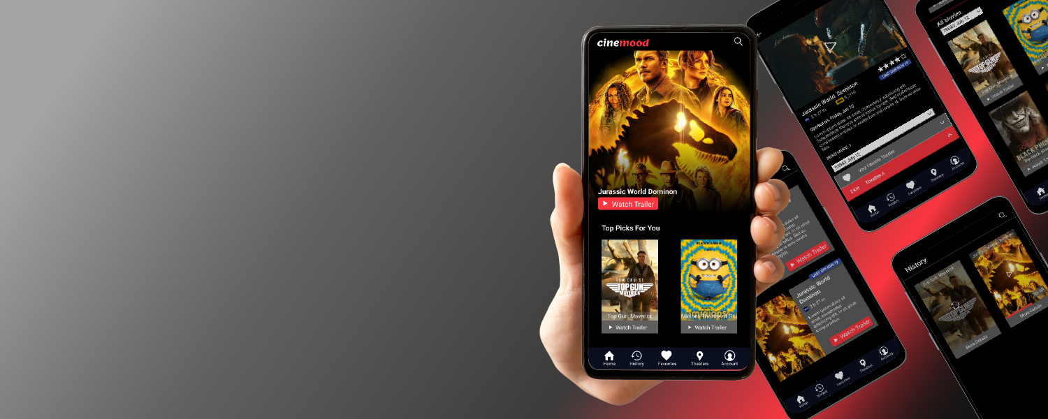
High-Fidelity Design
The high fidelity design was design after the first study, then it was adjusted based on the second usability study. The high-fidelity design was developed to help users to explore the app with minimal clicks, and include more helpful information about new movies and recommendations to aid users keeping updated and planning their next cinema outing more easily.
My main goal for this case study was to explore the entire UX design process while applying the knowledge I gained from the Google UX course. I wanted to cover the concepts from the first step of the process to creating a high-fidelity prototype that had been tested.
During the process, I understood the importance of empathizing with users and how a usability study uses this empathy to discover what a user really wants to express. The way users speak, their body language, and their actions all communicate valuable information. I noticed how every detail was important, from how to ask questions to how colors and layout can help the user. I also considered whether a new screen was necessary or if the information should be integrated into an existing one. It was enjoyable to think about these details and see how the changes made users feel more comfortable with the app.
Thank you for reading!
Explore my other case studies:

•UI • PC • Game Design •
Plant Therapy

• UI • UX • PC • Testing • Game Design •