
•UI • PC • Game Design •
Project Overview
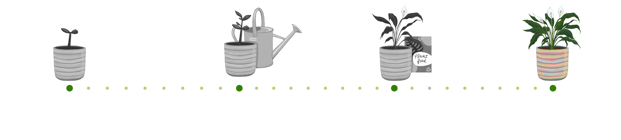
GAME TYPE: GARDENING SIMULATION
LEVELS: 4
STATUS: WORK IN PROGRESS
ABOUT THE GAME
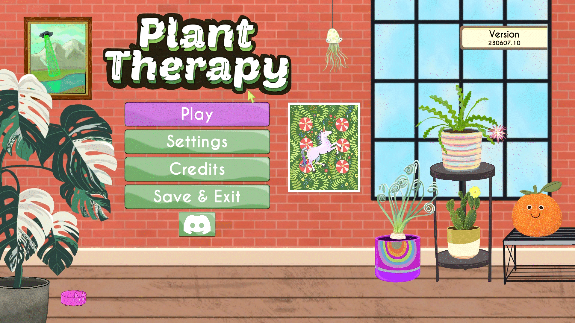
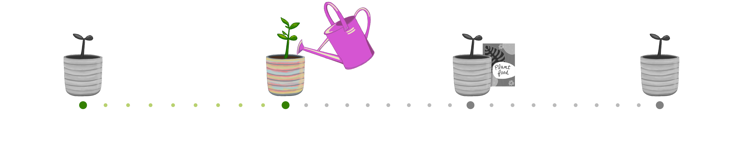
Plant Therapy features a cozy computer game in which players can decorate their New York City apartment with plants, art, and more. By watering, fertilizing, and growing plants from sprouts, players can earn coins and unlock achievements.
Watch some of the current gameplay
Project Roadmap
Color, Icons and Logo
The first step in improving the UI was to establish fonts, a color palette, and a new logo. These changes were released in an update to signal to players that Plant Therapy was being renewed and expanded. In addition, I was introduced as the UI designer.
New Icons
The previous icons used to interact with the game were compressed with the in-game currency counter, whereas the new ones were designed to be standalone elements if required. The decision to change the icons was driven by our goals to:
Ensure icon consistency, making it easier to add more icons in the future if necessary.
Address the existing confusion surrounding the "door icon," which was used to go to the city. Some players commented that they felt the icon would close the game.


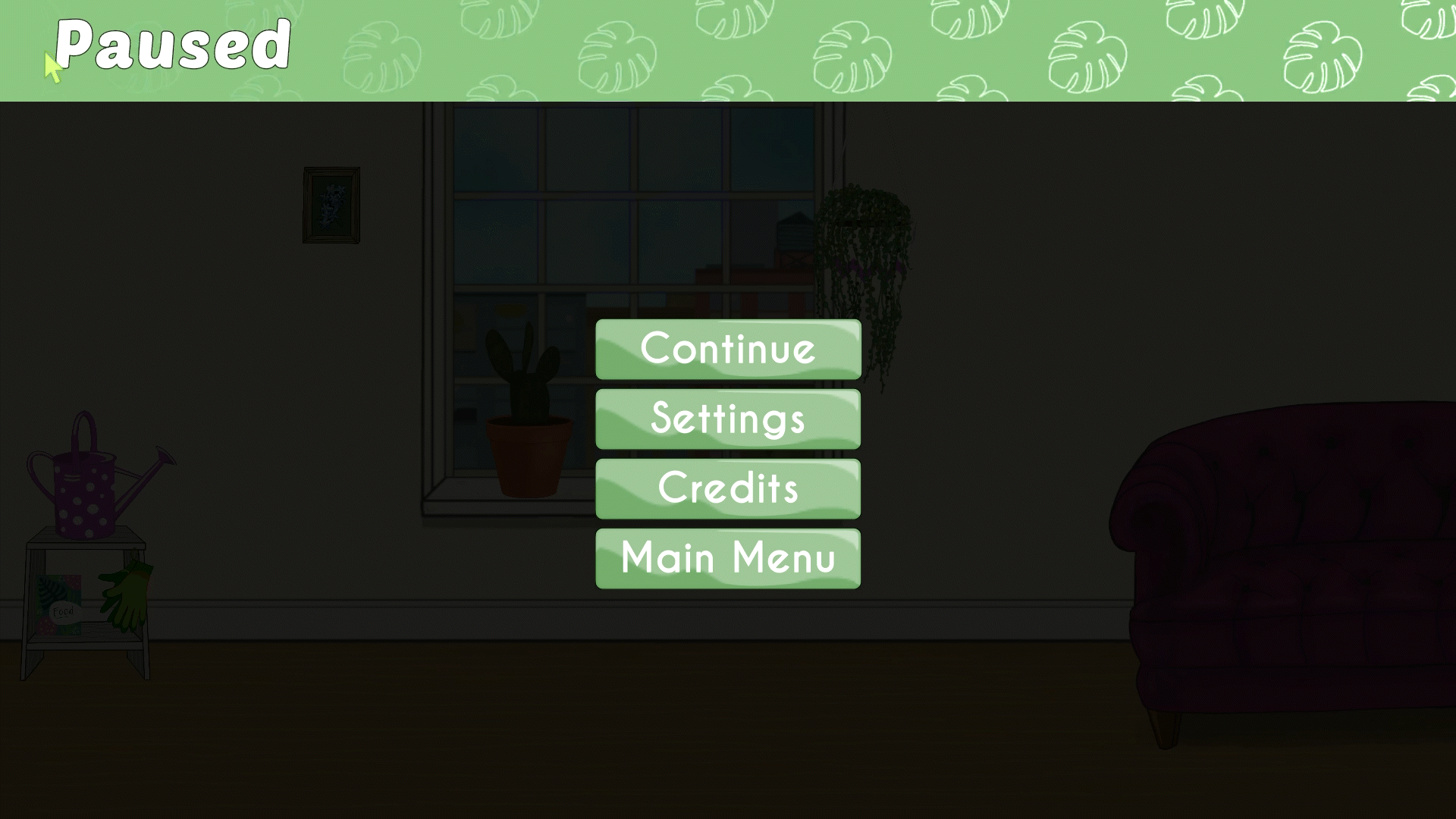
Frontend Menus
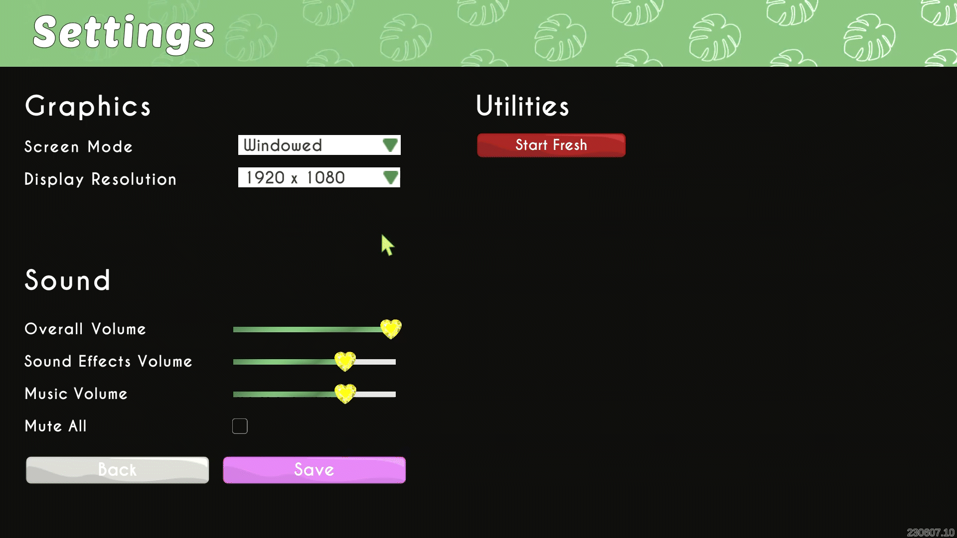
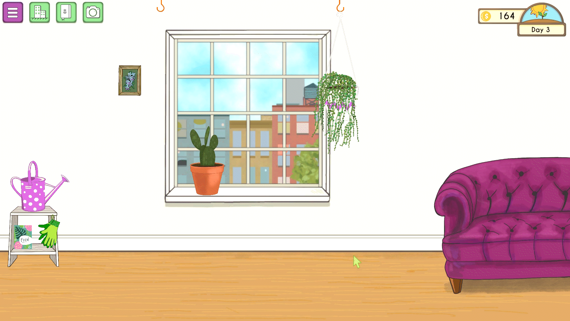
Improving the UI involved updating various screens, including configuration, splash, credits, and the main game screen. We began by revising the main game screen to evenly distribute the visual elements across the interface, as previously, most of the weight was concentrated in the top right corner. Subsequently, we proceeded to enhance the splash, credits, and configuration screens, incorporating more of the game's essence into their designs.
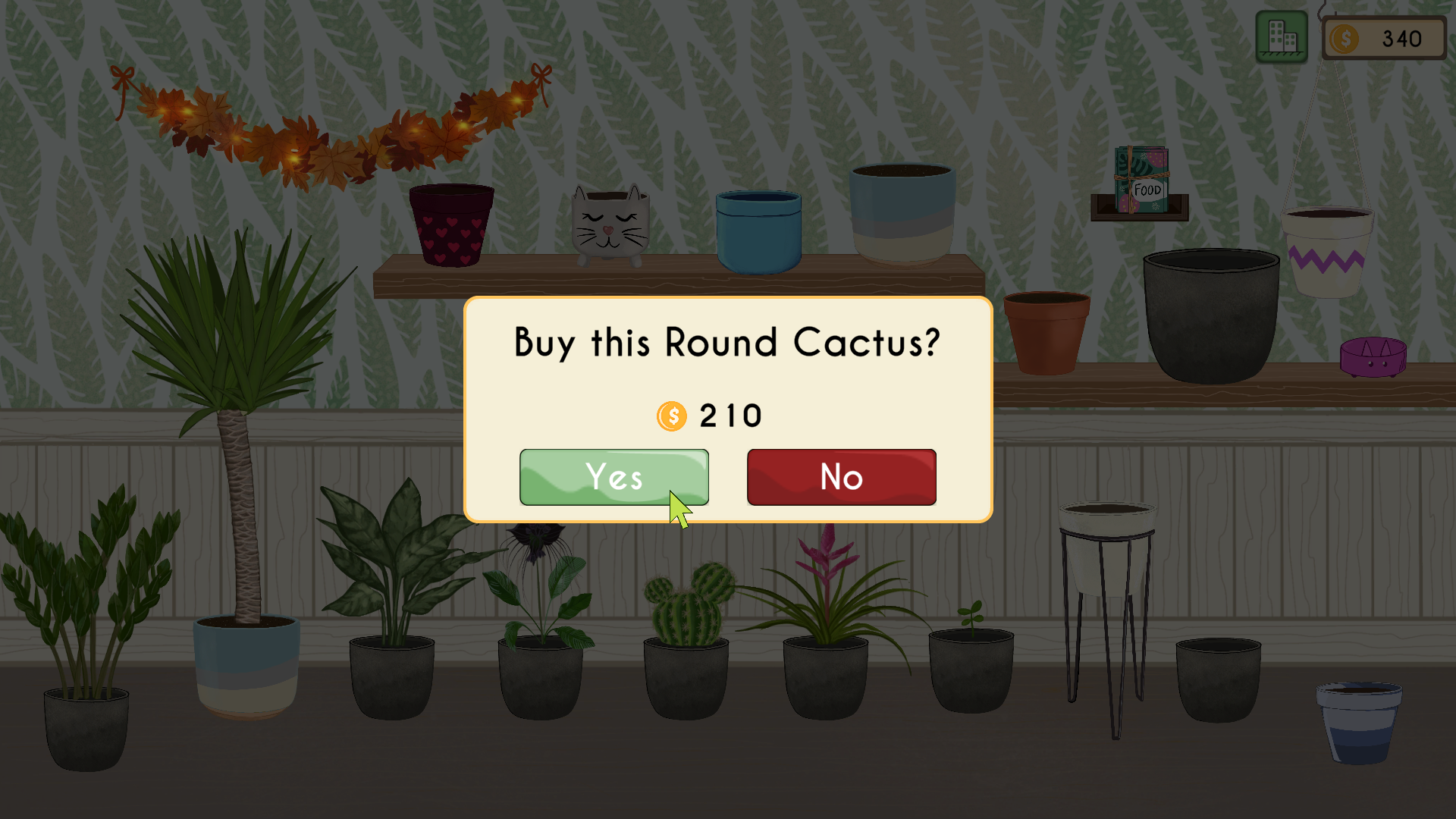
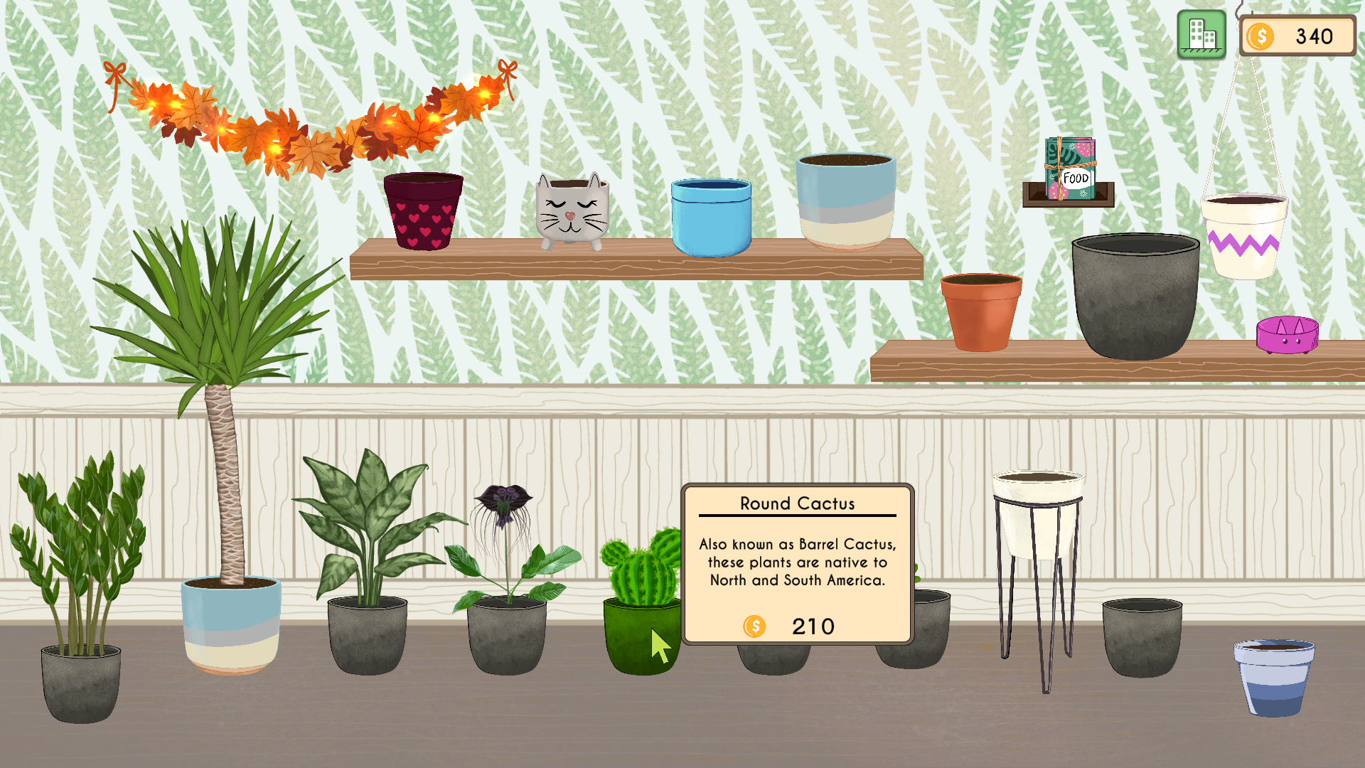
Buying
The existing buying feature required users to click on the object they wanted to purchase, and it would be bought. However, user feedback indicated that this approach sometimes led to discouragement, as users accidentally ended up buying the wrong objects. In response to this feedback, we decided to improve the buying feature.

“Sometimes I want to look a plant at the store but I clicked and end up buying a plant I didn’t want and that took all my coins”
“When I started playing I had a hard time knowing how much any object was. It was hard to notice where the price was”
I mapped out a new user flow to enhance the current buying process, aiming to reduce the frustration that users were experiencing.
In this new flow, we introduced pop-up overlays to prevent users from purchasing the wrong objects (Confirmation overlay) and to provide more detailed information about each item. All items feature the same confirmation overlay, except for the fertilizer, which allows users to buy it in bulk.
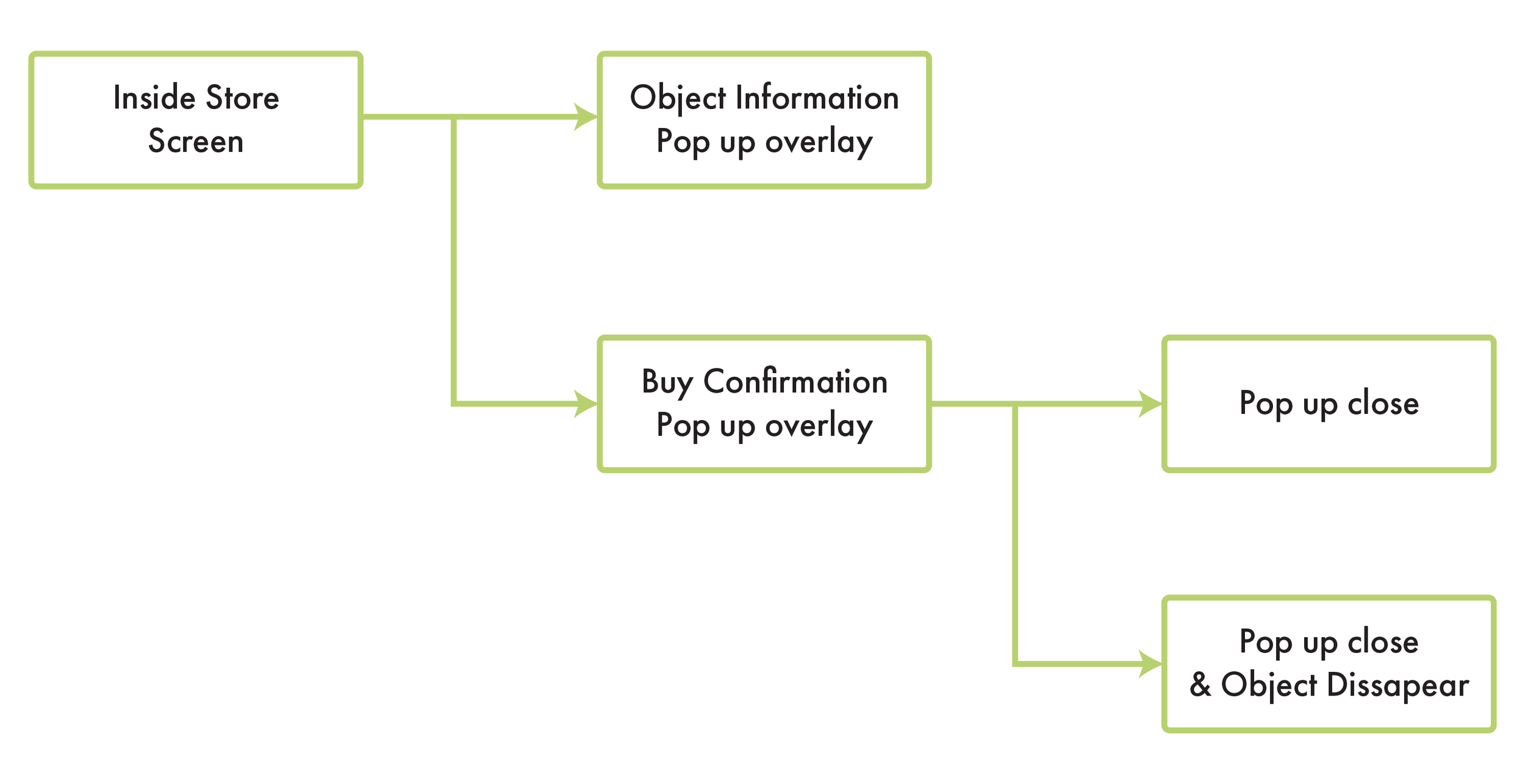
User Buying Screen Flow
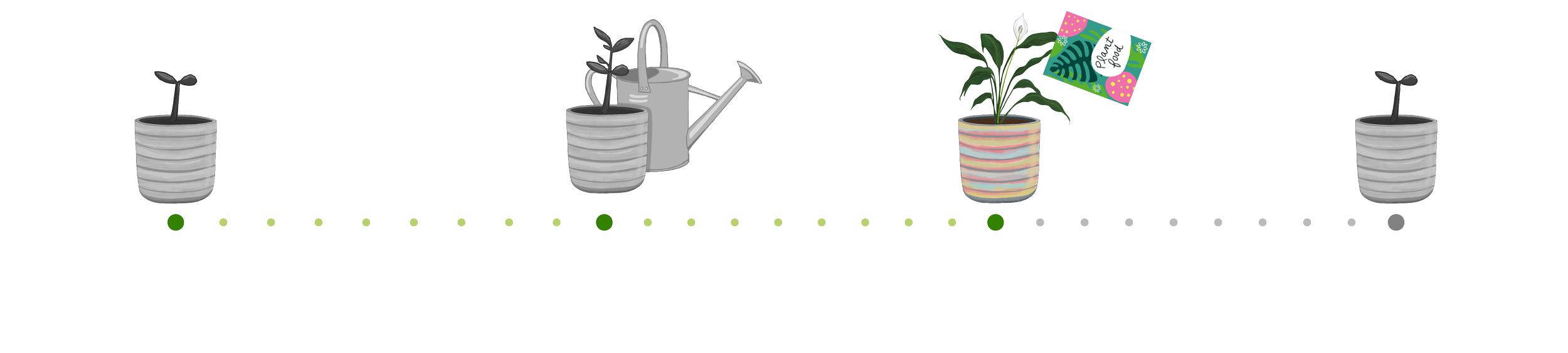
Taking photos
The improvement of the feature that I helped with focused on designing a more stylized and consistent UI, adding visual feedback for the user in the user flow to help them confirm that the photo was taken, and creating a new layout that provides a better view of the screen. Additionally, I created the hand icon for both relaxation and screen grabbing.
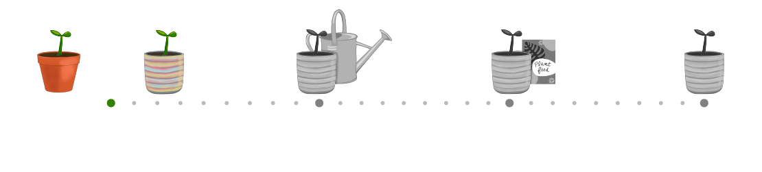
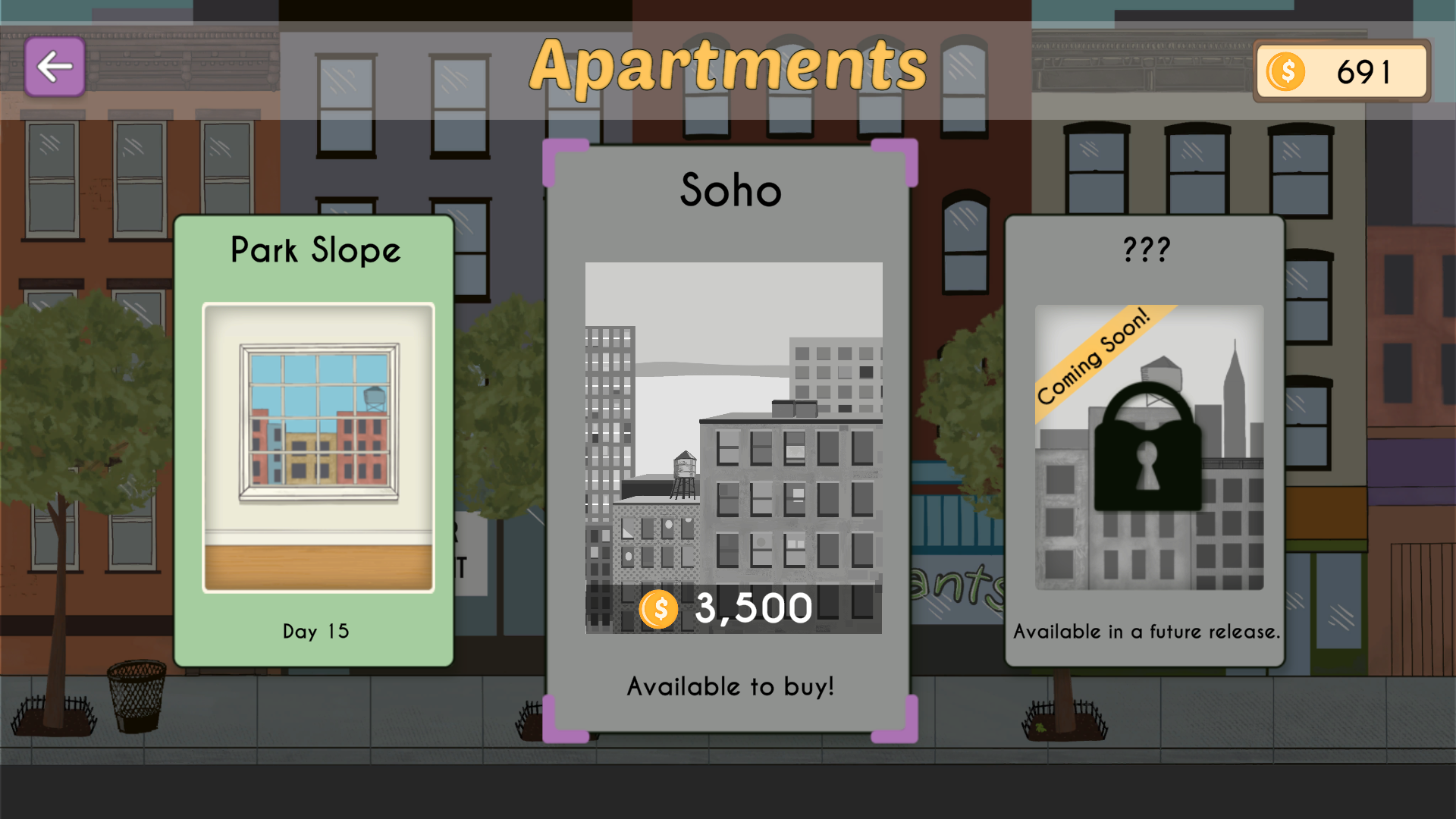
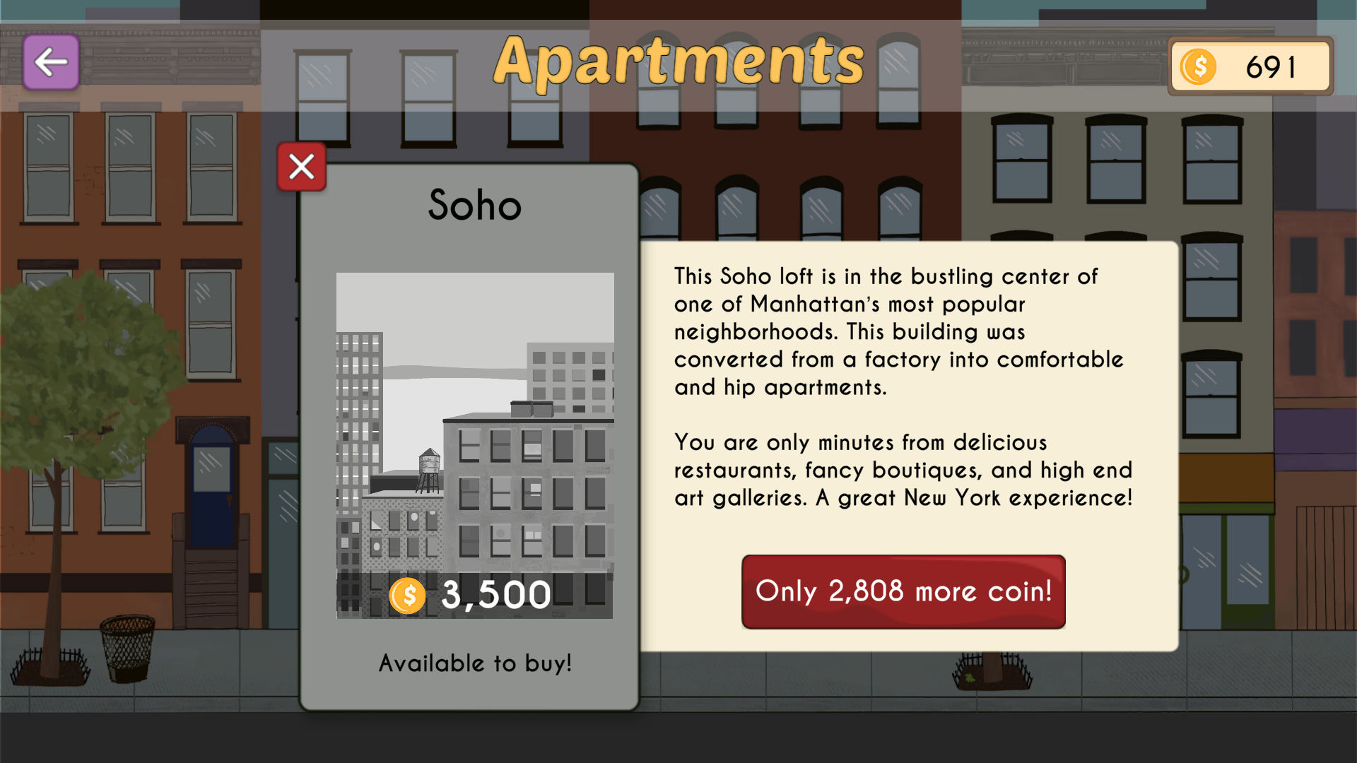
Level Selection Screen
The apartment selection screen was introduced to allow players to easily switch between apartments. This layout provides a visual representation of each apartment, along with the number of days you have played on each one. Players were thrilled when this update was included, as they could visualize information about future content.
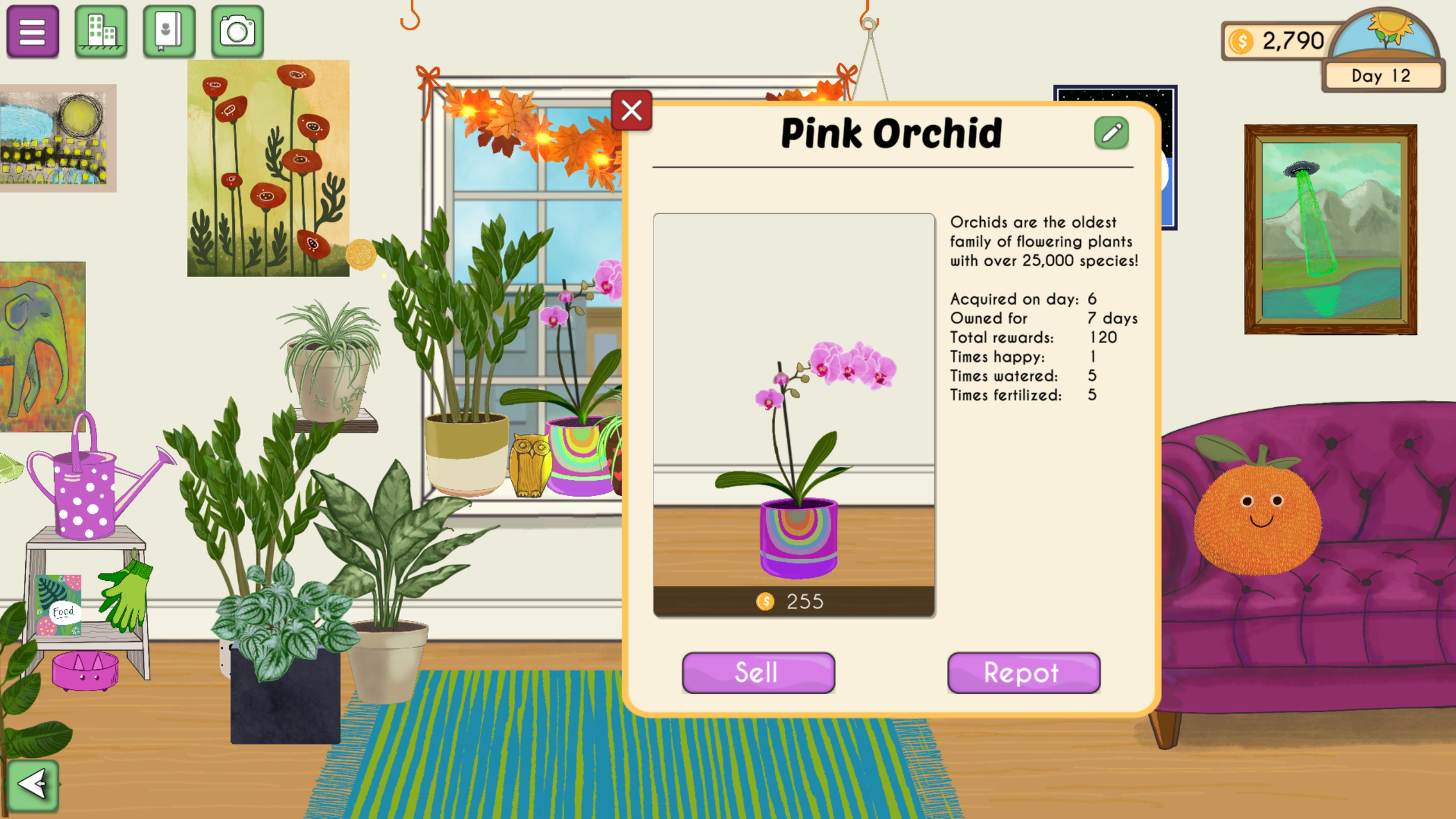
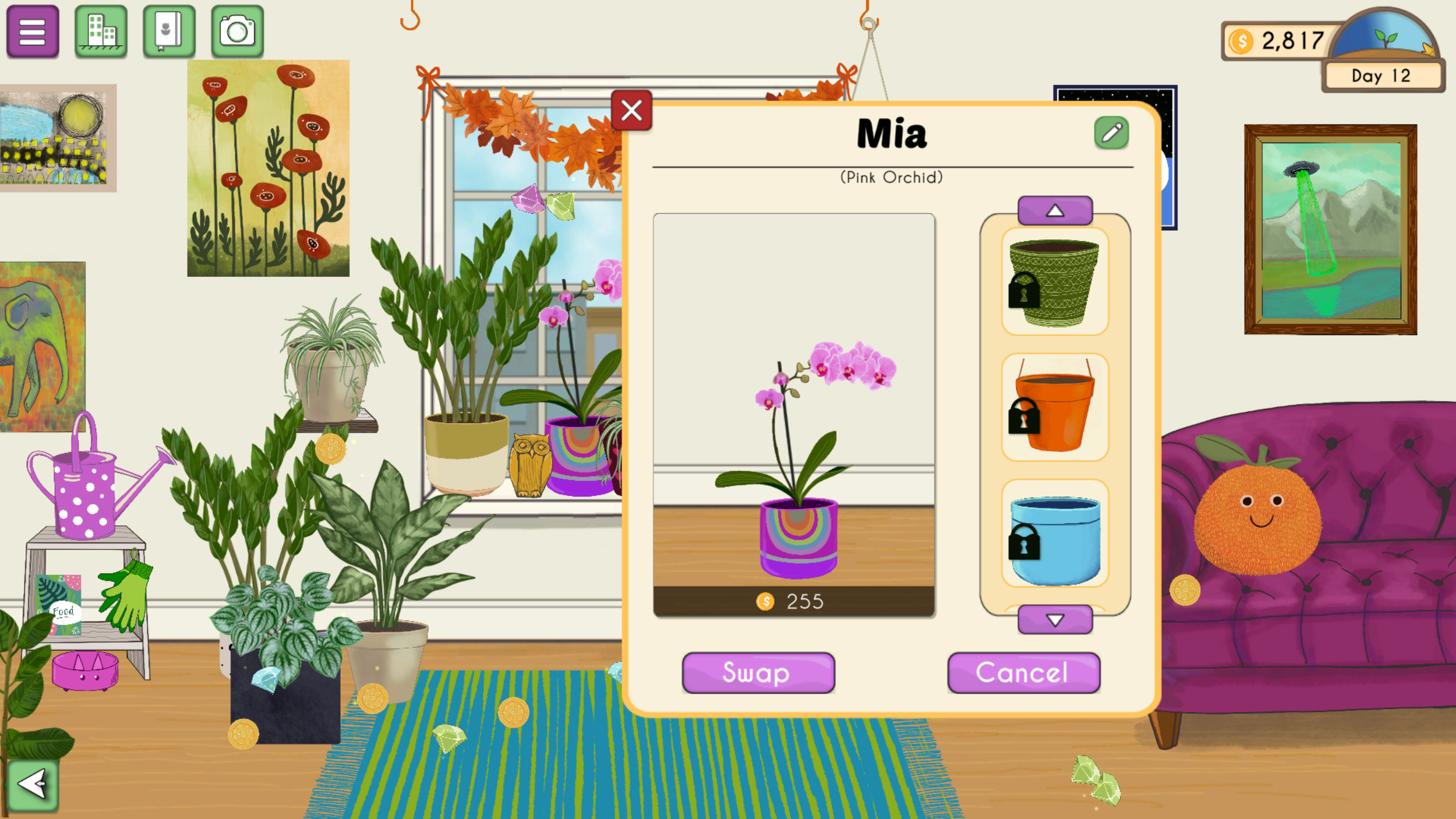
Plant Details Pop Up
This overlay was created to support the new features the studio wanted to incorporate and fulfill the needs of the players.
The new overlay changed the gameplay players were used to since previously, an icon on the main screen would activate the sell feature.

“As a player I want to be able to check my plant details, and to add a nickname to my favorite ones”

“As the game studio, we want to include a pot swap feature, and to relocate the sell option in this overlay”
Through some fast mockup iterations for layouts, I explored how to include the desired content while balancing the information provided to the player, creating an intuitive flow.
Collectable Menu
For this screen, I explored different layout options and hierarchies. I balanced the information given to the player to spark curiosity for discovering more items, instead of making them feel overwhelmed by the quantity of content in the game. This image is an example of a high-level mockup I created during the design process, which I shared with the team for collaboration.
However, some game design considerations were made, and the final design removed the feature to buy. For this reason, it became unnecessary to show the money counter since the journal will no longer interact with the in-game currency. Furthermore, the final visual aspect of the collectable menu became more like a stamp album that should be filled out by the player.
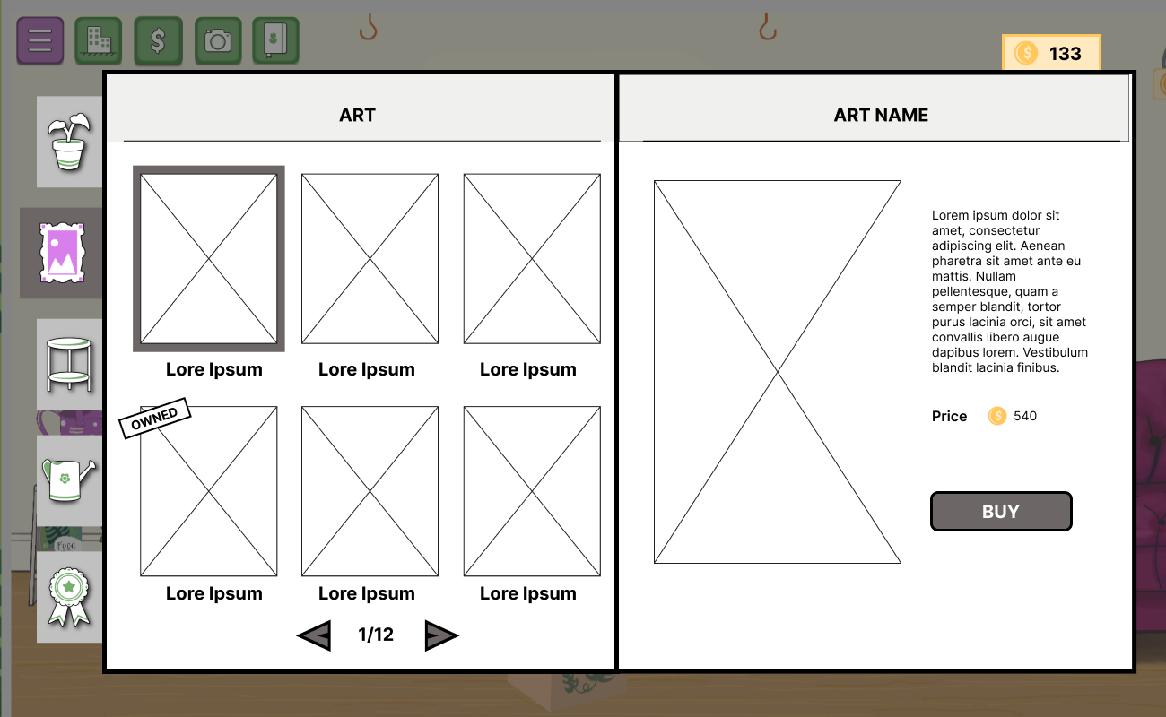
High-level Mockup for Collectable Menu
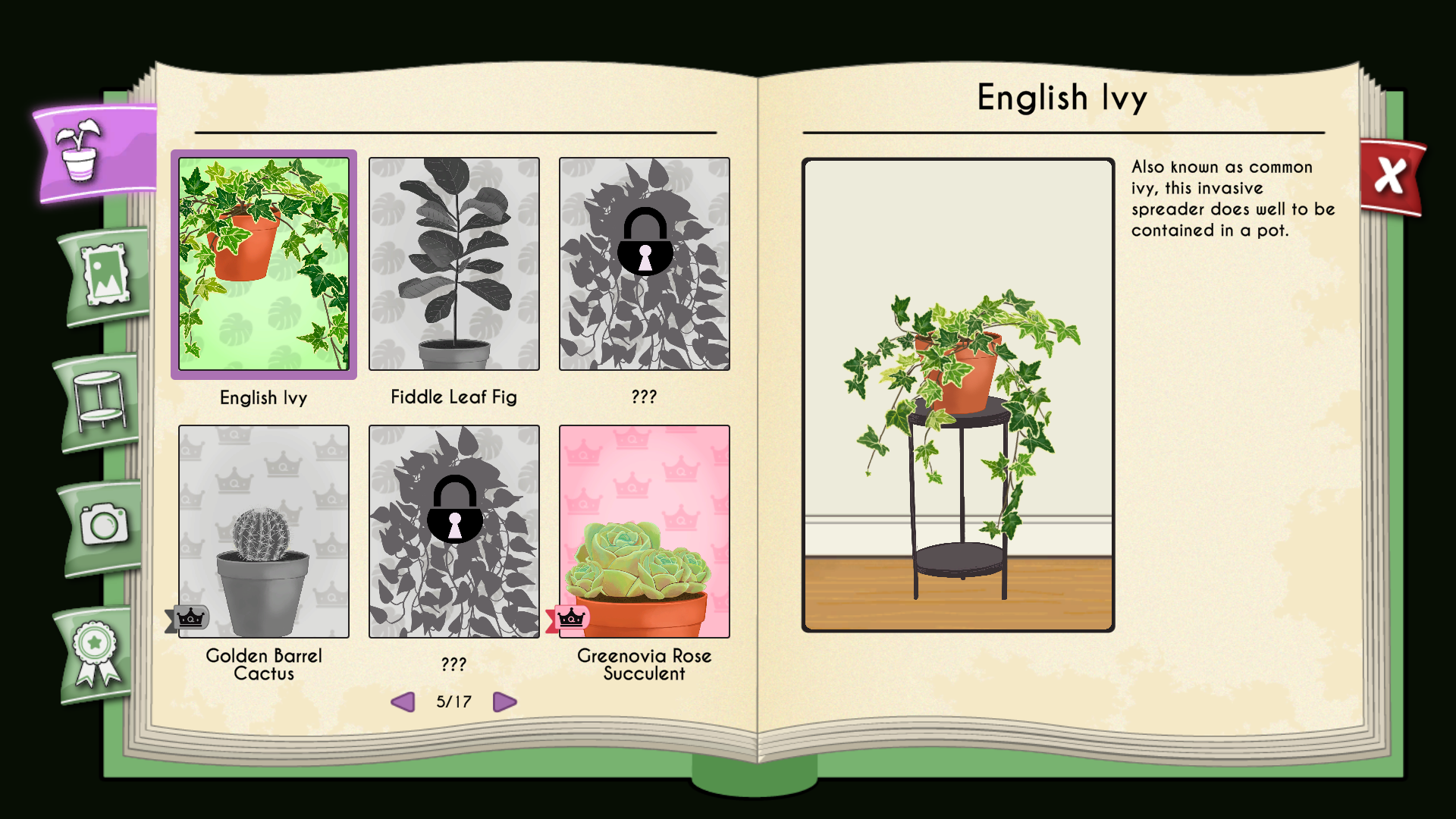
Current in game implemented Collectable Menu
My experience working on Plant Therapy and with the Short Leg Studio team has been a great experience. Seeing how a game can change and improving it by modifying elements of the UX/UI was a rewarding experience, specially since it was a free game every new update usually brought new players that provide the team with new feedback.
Thank you for reading!
Explore my other case studies:

Cinemood
•UI • UX• Mobile • Design Practice •

Kittyverse
• UI • UX • PC • Testing • Game Design •